NEWS
Keeping it “Seuss”: The Film’s Look
11 Mar 2008 By TNPihl (JCO Editor-In-Chief)
Determined to stay true to the vision and magic of Dr. Seuss’ environments and characters while translating his pen and ink style into a fully dimensional world, Jimmy Hayward and Steve Martino visited the Geisel Library at the University of California San Diego, which houses all of his original work. Searching for clues to Seussian design, the filmmakers studied the author’s original art and read every manuscript, even his handwritten notes and annotations. Says Steve Martino: “I was particularly taken by some sculptures Seuss had done, which provided direction on how he would have translated his ideas and world into three dimensions. We found some subtle references to color, shape and texture that would incorporate into the film.
“Looking at the body of Dr. Seuss’ work for inspiration, we began to get into a zone of Seussian exaggeration,” Martino continues. “It became infectious, and we began to dial into Seuss’ visual vocabulary. We would digitally brush the hair of a Who, for example, and ask, how can we do that Seuss-style? Being in his world stimulated our imaginations.”
From the Seuss works he and Hayward painstakingly studied at the archives, Martino created a style guide that provided a foundation from which the filmmakers created a fully dimensional, textured and realistically lit world. “We could take a camera through the 3-D world we were building and explore it in great depth,” notes Martino.

© Blue Sky Studios. Steve Martino
Seuss enjoyed surprising people with little details and off-kilter designs. The key to success in translating his work to the world of computer animation was making these details and designs fun and relatable. The filmmakers called their approach “Seussian logic” – a process that ensured every crazy gizmo and contraption was entertainingly correct.
Who-ville, an entire city resting on a speck that has landed on a clover, resembles in some ways our world’s day-to-day existence: people go to school, they work and they shop. But a job in Who-ville might entail as Hayward points out, “laying on a couch all day eating bon-bons.”
Modes of transportation in Who-ville mix fun with relatability. The city’s multilayered streets are lined with sock-mobiles, roller-bladers on stilts, and unicyclists, to name only a few of the unusual ways the Whos get around. “If there’s a way to get someplace, we wanted to make it the most interesting and fun way to go,” says Martino. The aforementioned sock-mobile – a car that has four legs and walks…with socks – was a favorite of the filmmakers. It’s the perfect vehicle for a hospital zone or a library, or any area where silence was golden. Another favorite was the bed-mobile. “It would save a lot of steps in the morning,” says Hayward. “You could read a book on your way to work, or catch up on some sleep.”
If a sock-mobile or bed-mobile sound too conventional for you, then you might want to try Jo-Jo’s giant sling-shot device, which he uses to access an old observatory that figures prominently in the story. First, Jo-Jo sits down on a unicycle connected to the contraption, then he pedals back the unicycle, looking like he’s about to launch himself into a wall, grabs and pulls back on a lever, firing himself straight up in the air, to a hanging stairway.
What about recreation, like a game of tennis? Here, too, imagination and fun rule the day. “Dr. Seuss never took a straight line from point A to point B, so we reasoned that the Whos wouldn’t play on a ‘normal’ tennis court,” says Hayward. “We thought, Why not elevate half the court in one spot, and have these crazy stairwells running between the two court-halves?”
Gravity isn’t much of an issue in Who-ville, where narrow staircases with no railings spiral up into the sky, and where Whos routinely walk around on the sides of giant buildings. “There’s no reason to get hurt in Who-ville,” Hayward points out. “Getting hurt is no fun.”

© Blue Sky Studios
Even when Hayward, Martino and their teams came up with original designs, they wanted audiences to feel like they were experiencing something from a Seussian world “We worked to find an authenticity that fit into people’s memories of Seuss’ book,” explains Martino. Seuss’ Whos, for example, were bug-like with round heads. To make the characters more expressive, the filmmakers re-imagined the characters, giving them more facial mobility and brow movement.
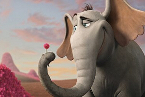
The filmmakers built upon the minimalist Nool conceived by Seuss, who in his book, says art director Thomas Cardone, “left huge white spaces for text and some artwork. So we really didn’t start with a Seuss jungle because he didn’t create one.” The movie’s Nool is like no jungle we’ve seen before, rich with enormous swirling fronds, billowing blue bushes and towering palm trees topped with hair-like tufts.
But even here, Seuss was an important inspiration. “We needed to create that white space, so to speak,” explains Steve Martino. “We began by using Seuss’ unusual jungle color palette – reds, blues and other odd colors, and fur plants” – a far cry from the lush, green you’d expect in a jungle. “Every leaf in Nool has a kind of Seuss flare, such as asymmetrical curves, and little patterns in the veining.” Adds Cardone: “When you look at a Seuss tree, it will always be heavier on one side, and look different from all angles.”
-- Source: Twentieth Century Fox Animation.
» Send to friend
« Newer article | Overview | Older article »


